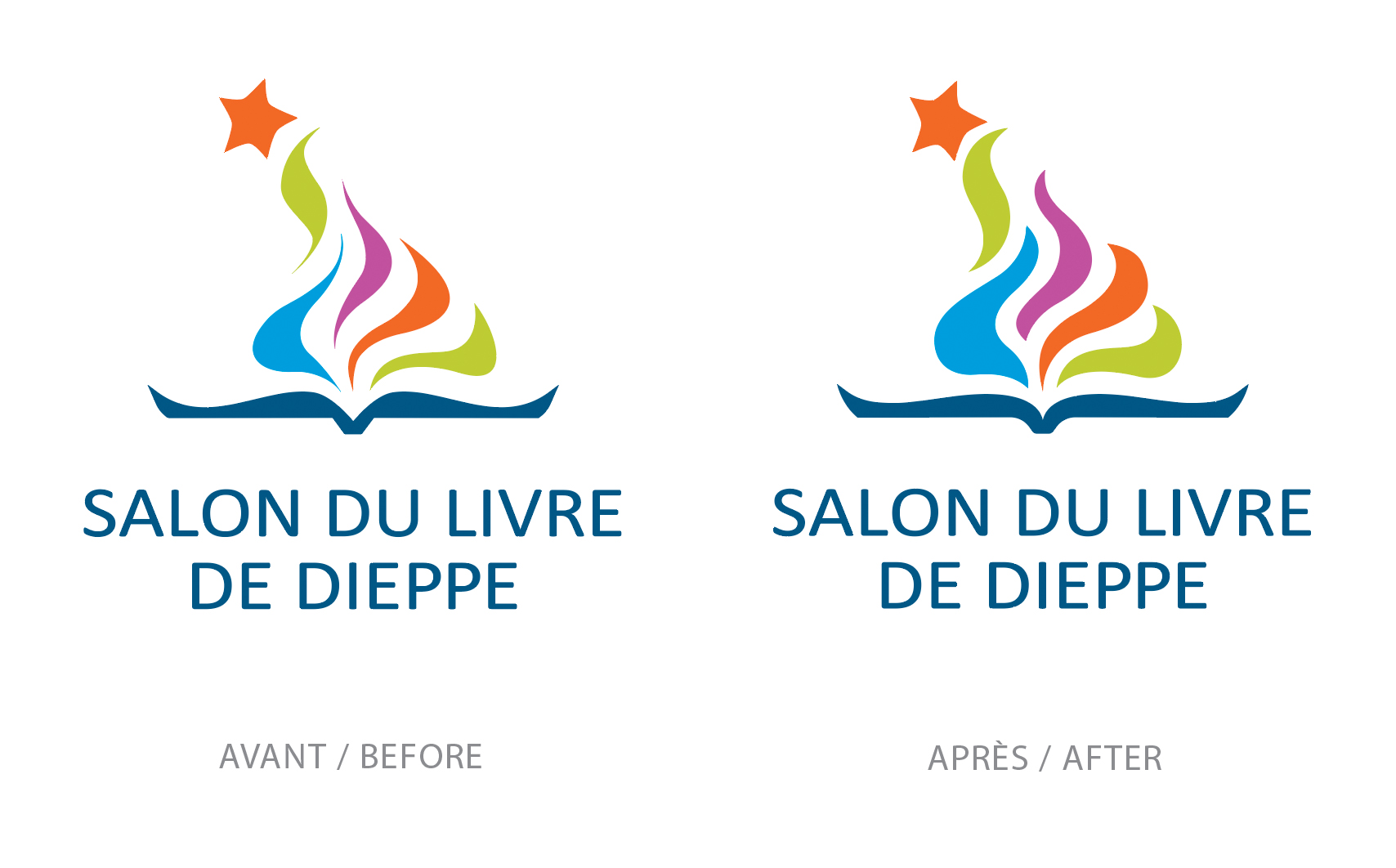
Here’s a recent example of modifications to an existing logo. Since I had to work with this logo this year’s edition of the festival, I suggested some slight changes which were approved by the client. A before and after scenario – barely visible edits but important as far as the aesthetics of the image is concerned. The pink lines represent the old shapes in comparison to the new ones. It’s all about the flow of the curves, which has a considerable effect on the personality of the logo.
Voici un exemple récent de modifications apportées à un logo existant. Comme je devais travailler avec ce logo pour l’édition de cette année du festival, j’ai suggéré quelques légères modifications qui furent approuvées par le client. Un scénario avant et après – des modifications à peine visibles mais importantes en ce qui concerne l’esthétique de l’image. Les lignes roses représentent les anciennes formes par rapport aux nouvelles. Tout est question de fluidité des courbes, qui a un effet considérable sur la personnalité du logo.